
CLIENT CASE STUDY
HEAL WITHIN
For Heal Within, the goal was to elevate the brand’s visual identity while staying true to its grounded, wellness-driven foundation.
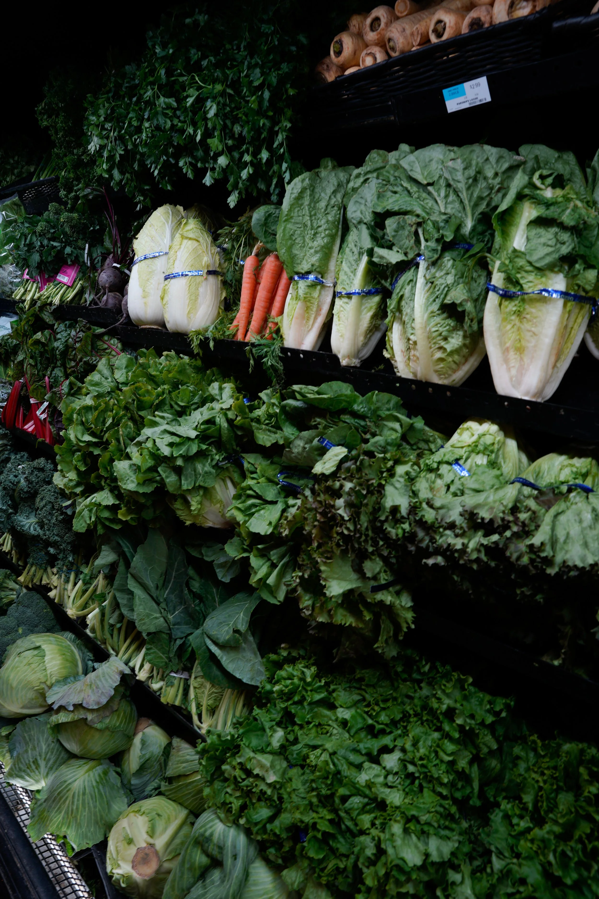
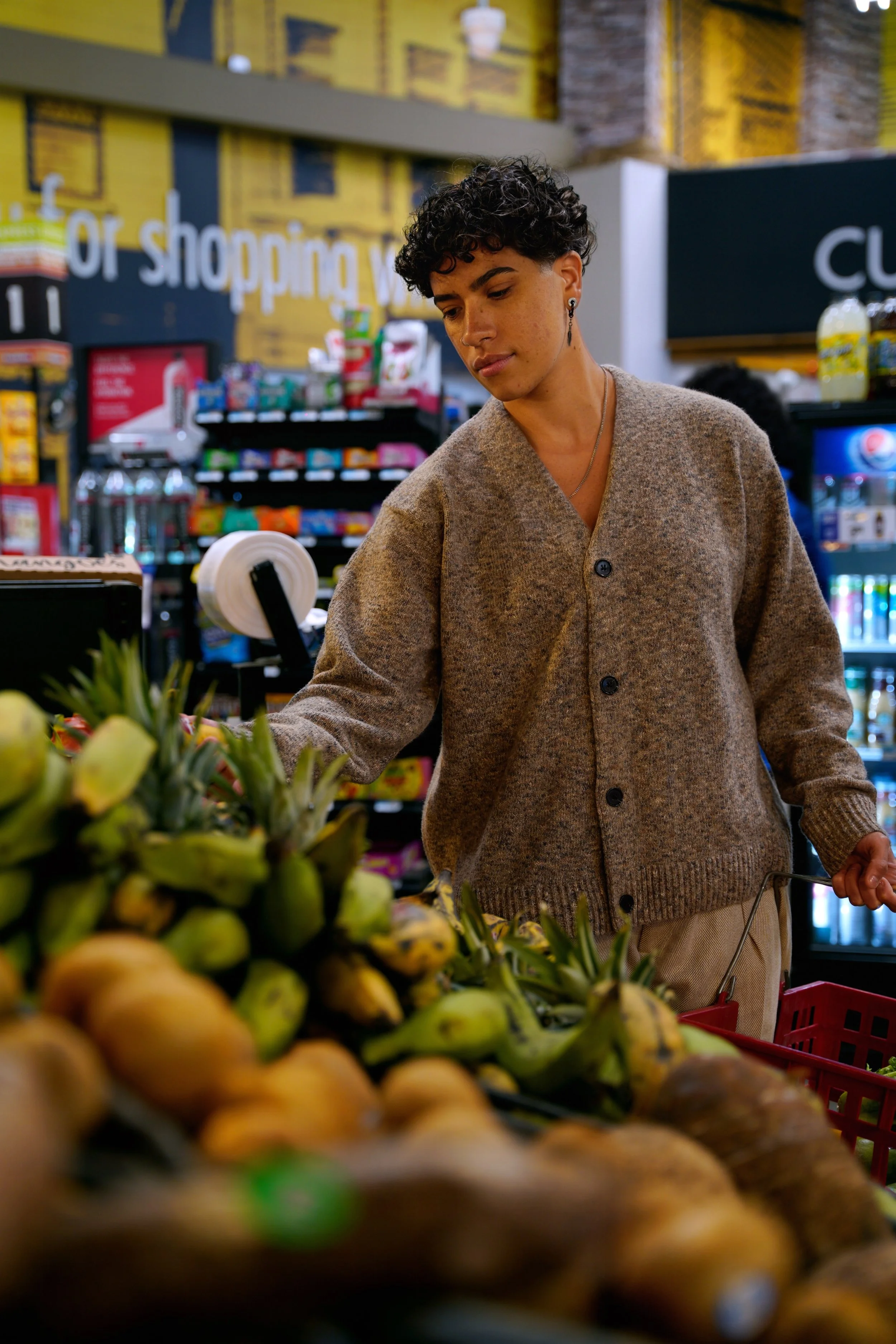
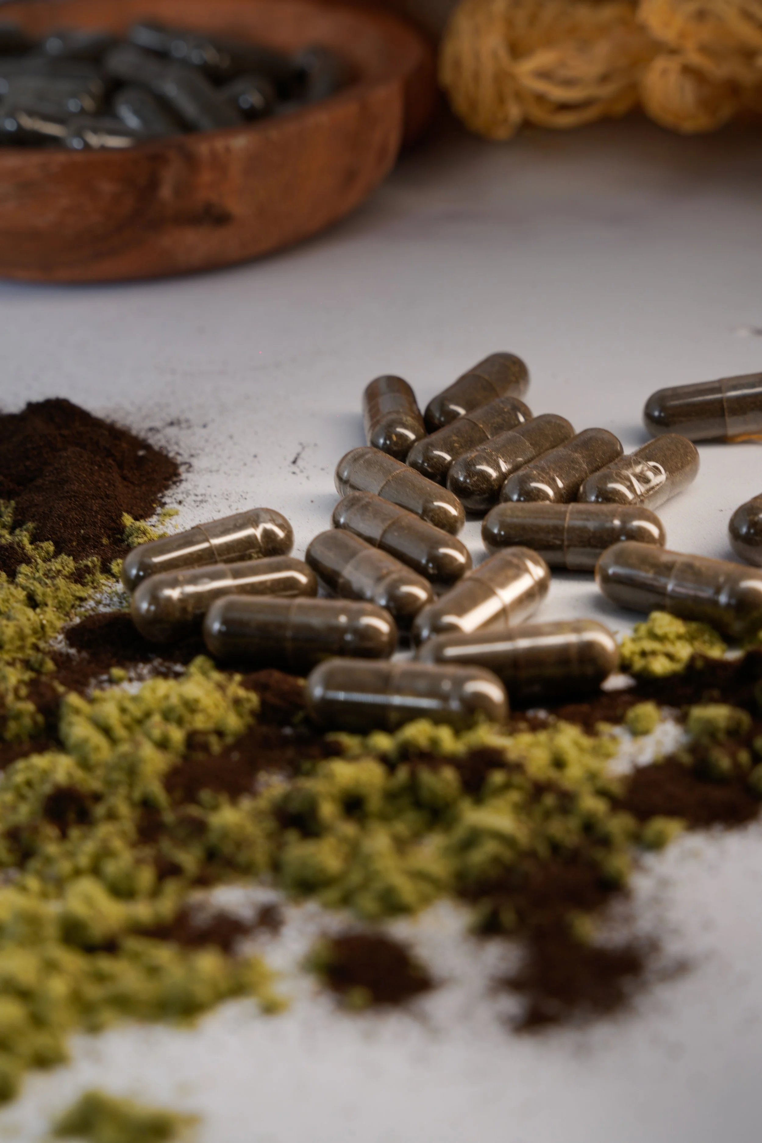
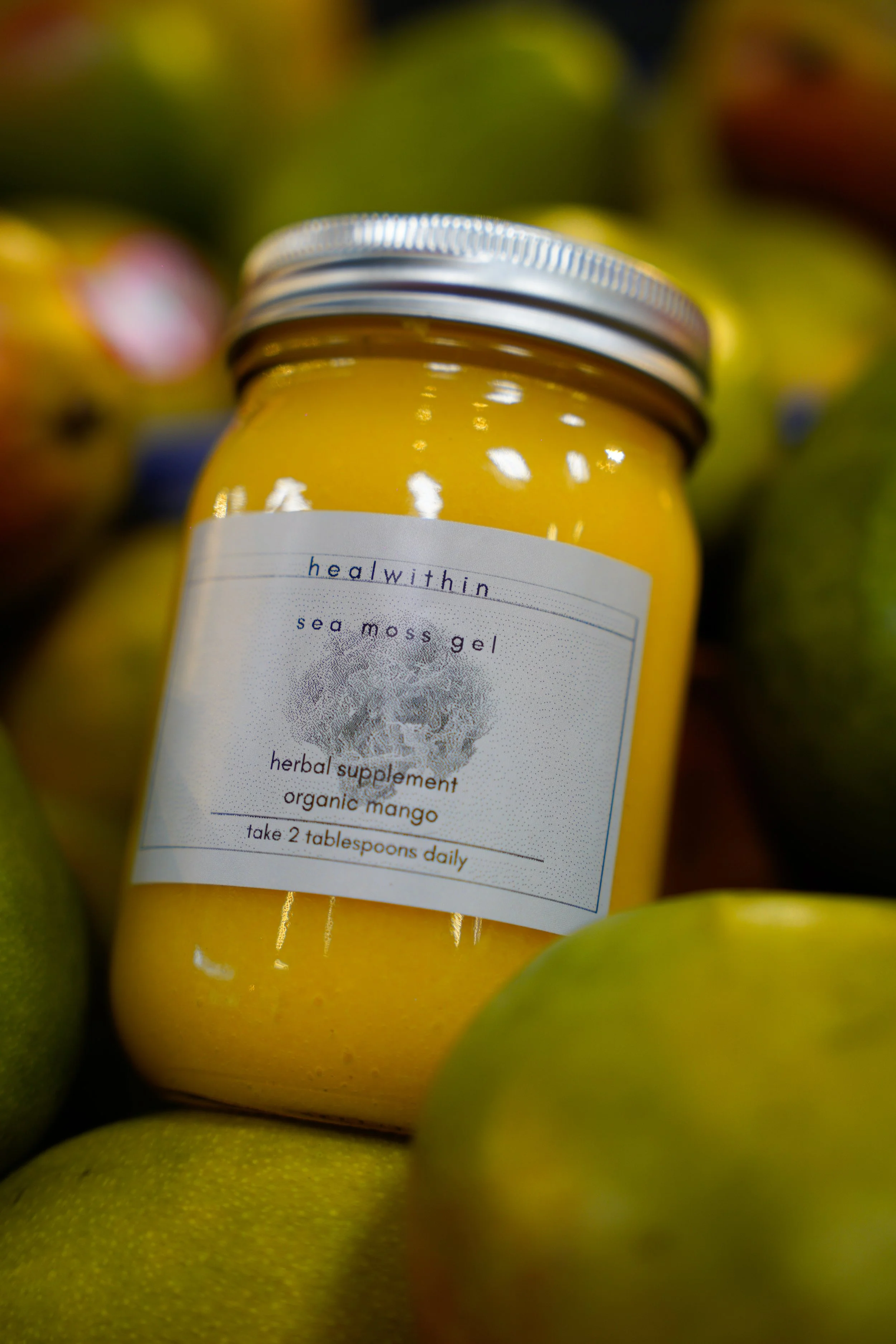
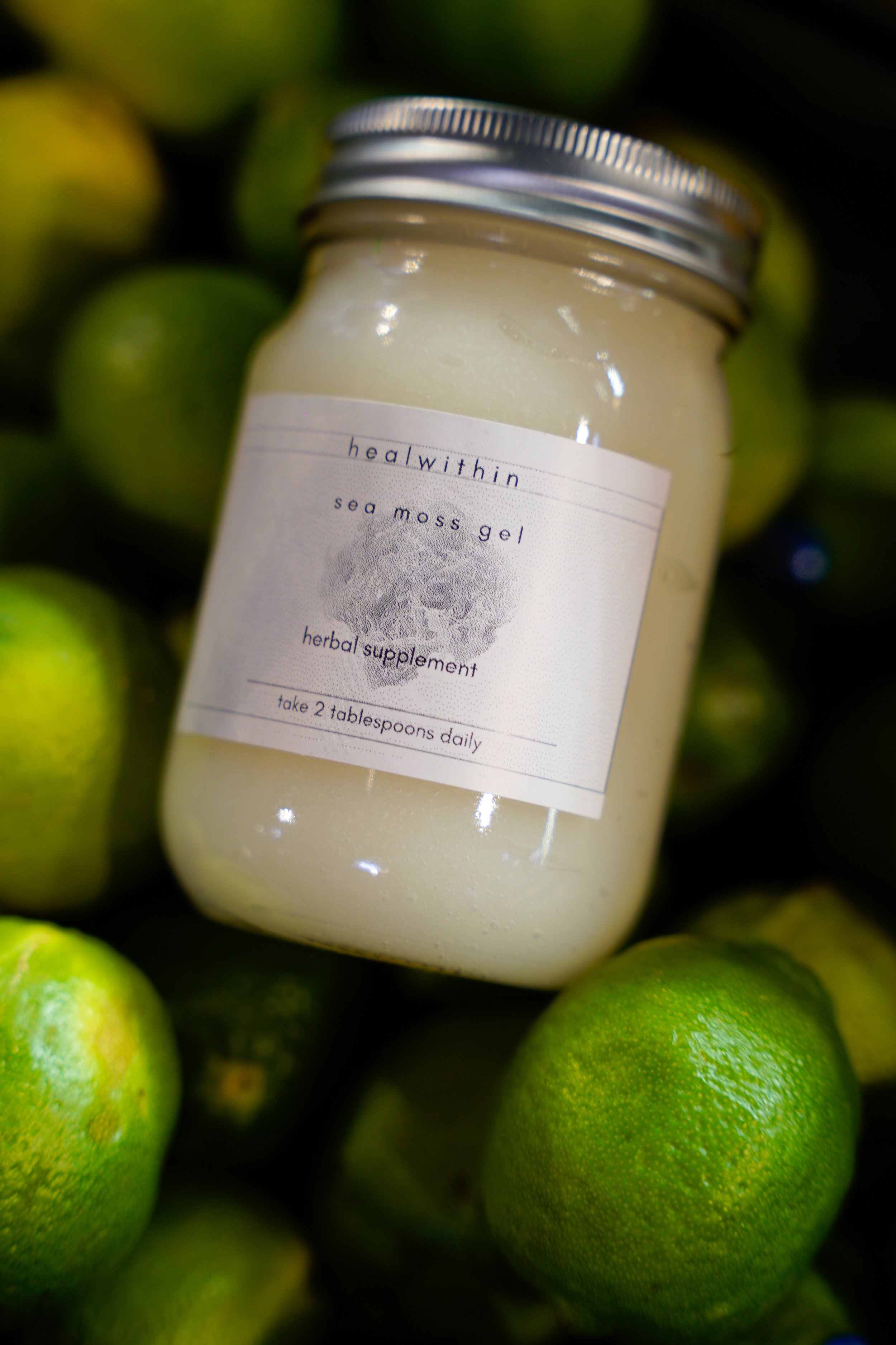
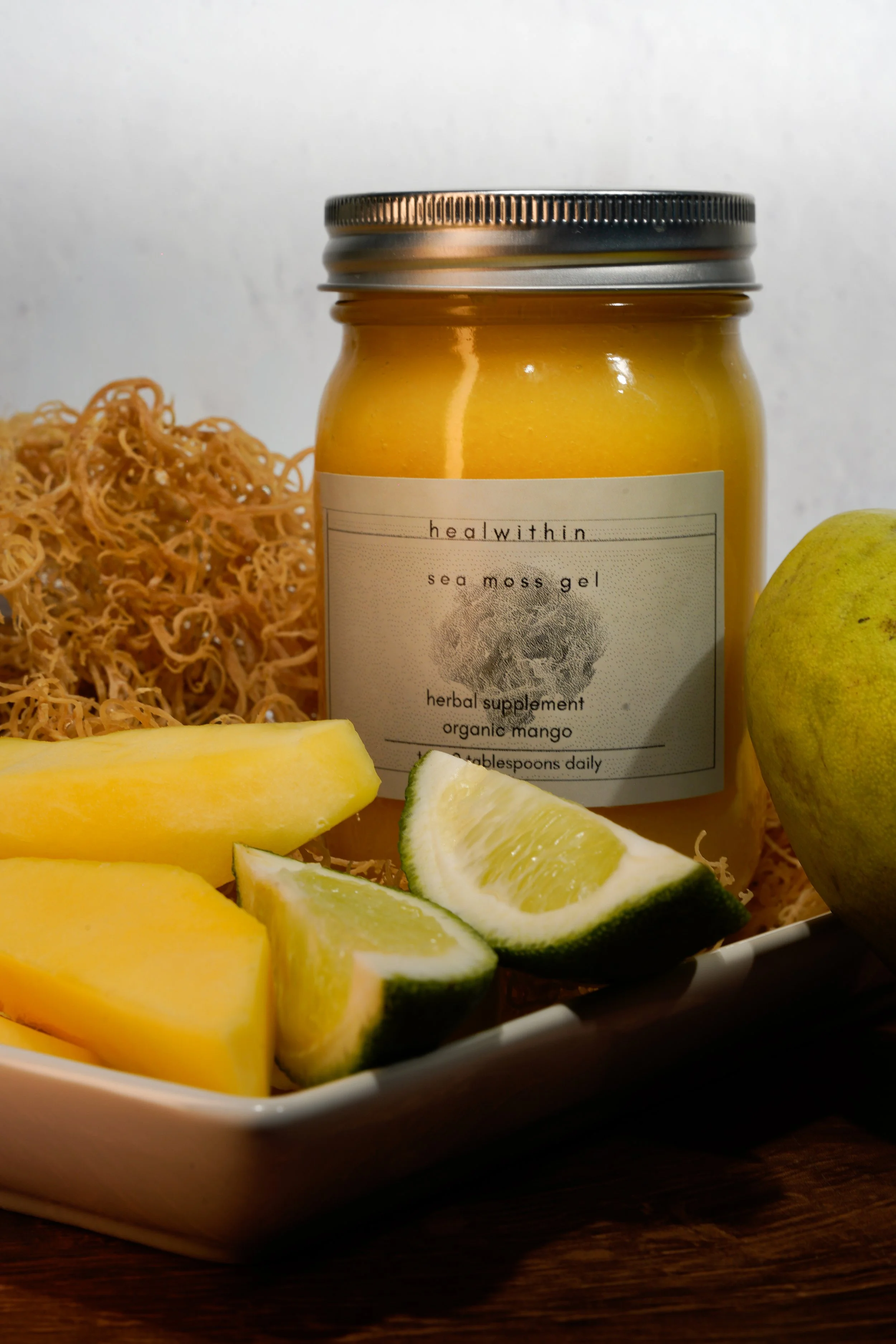
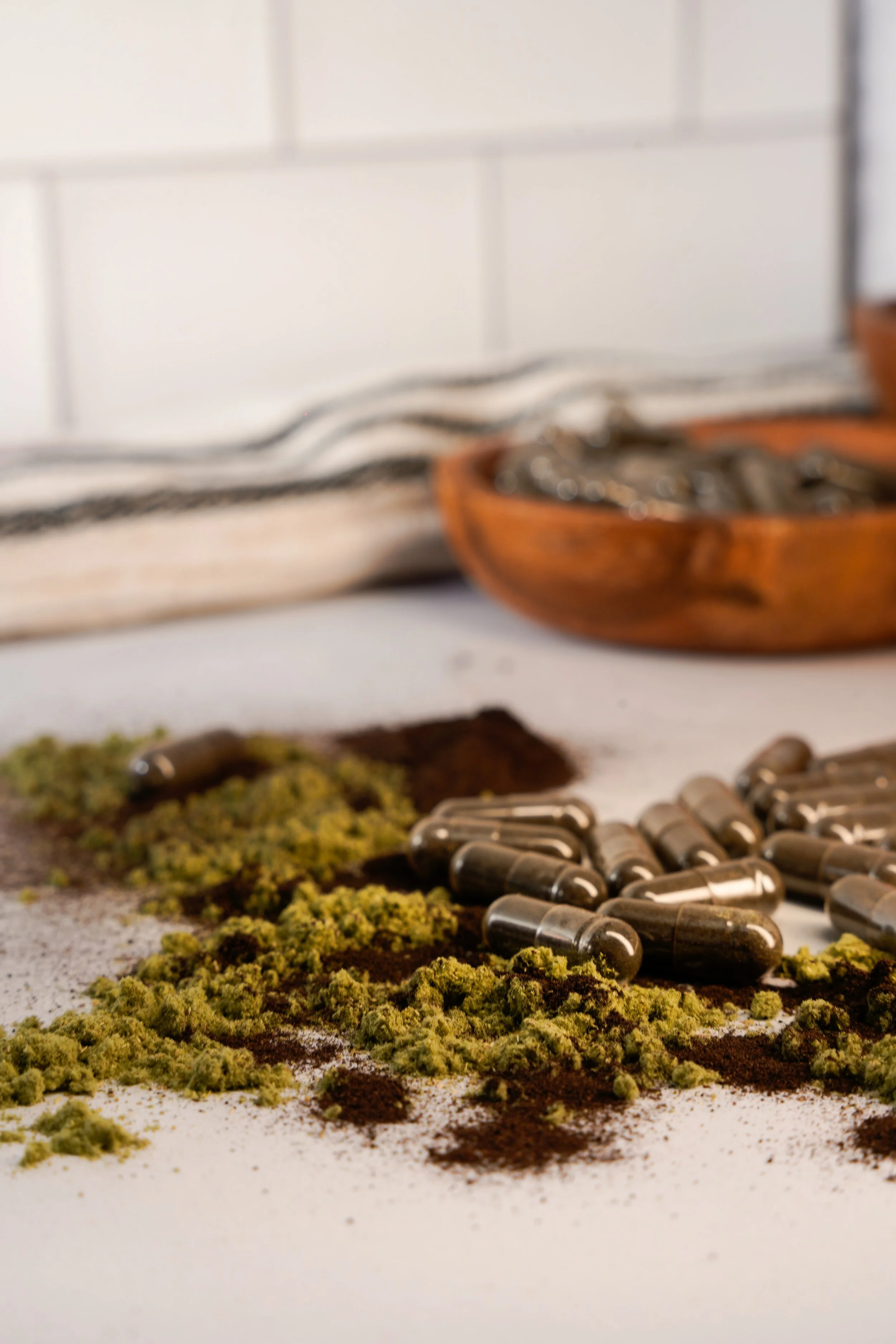
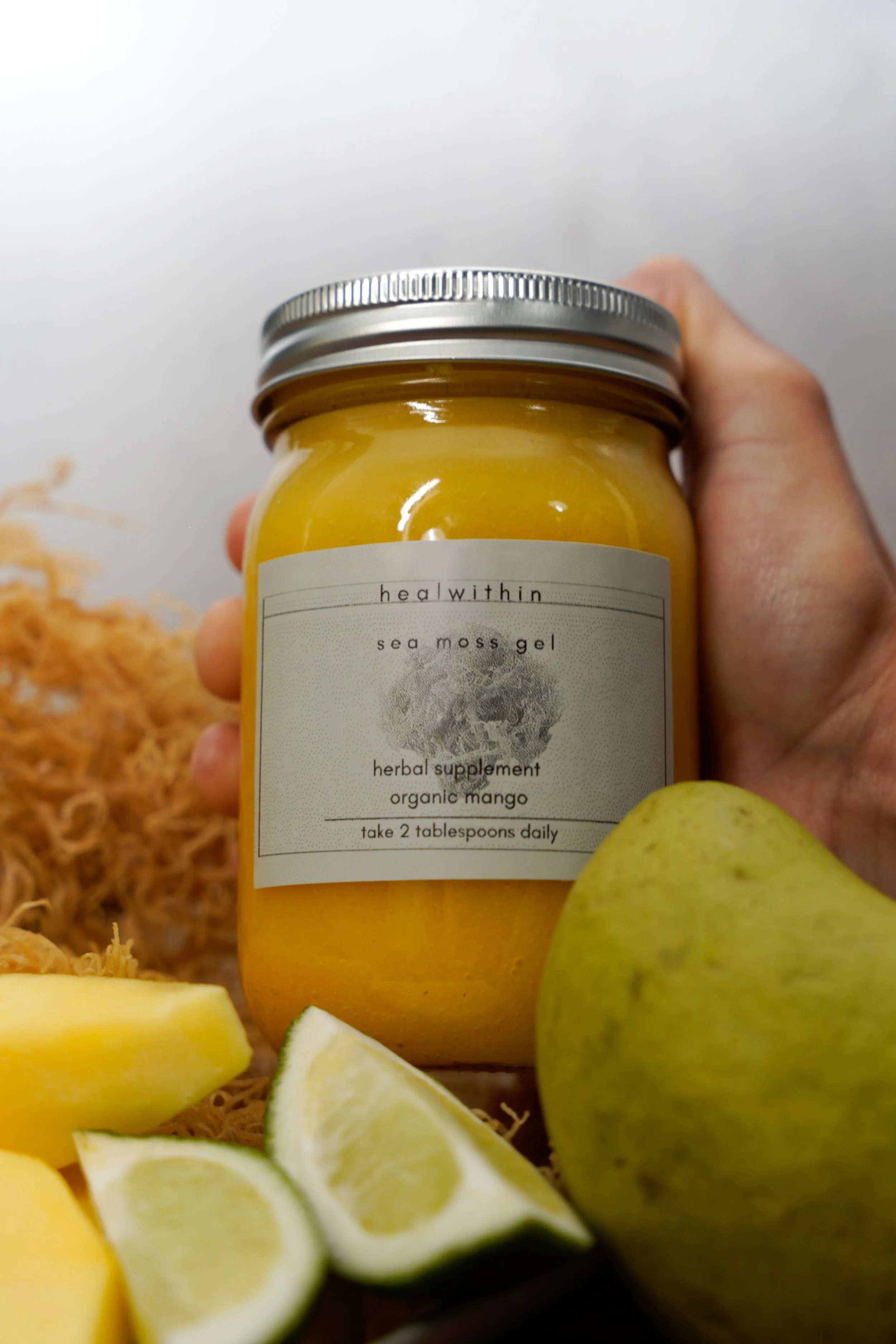
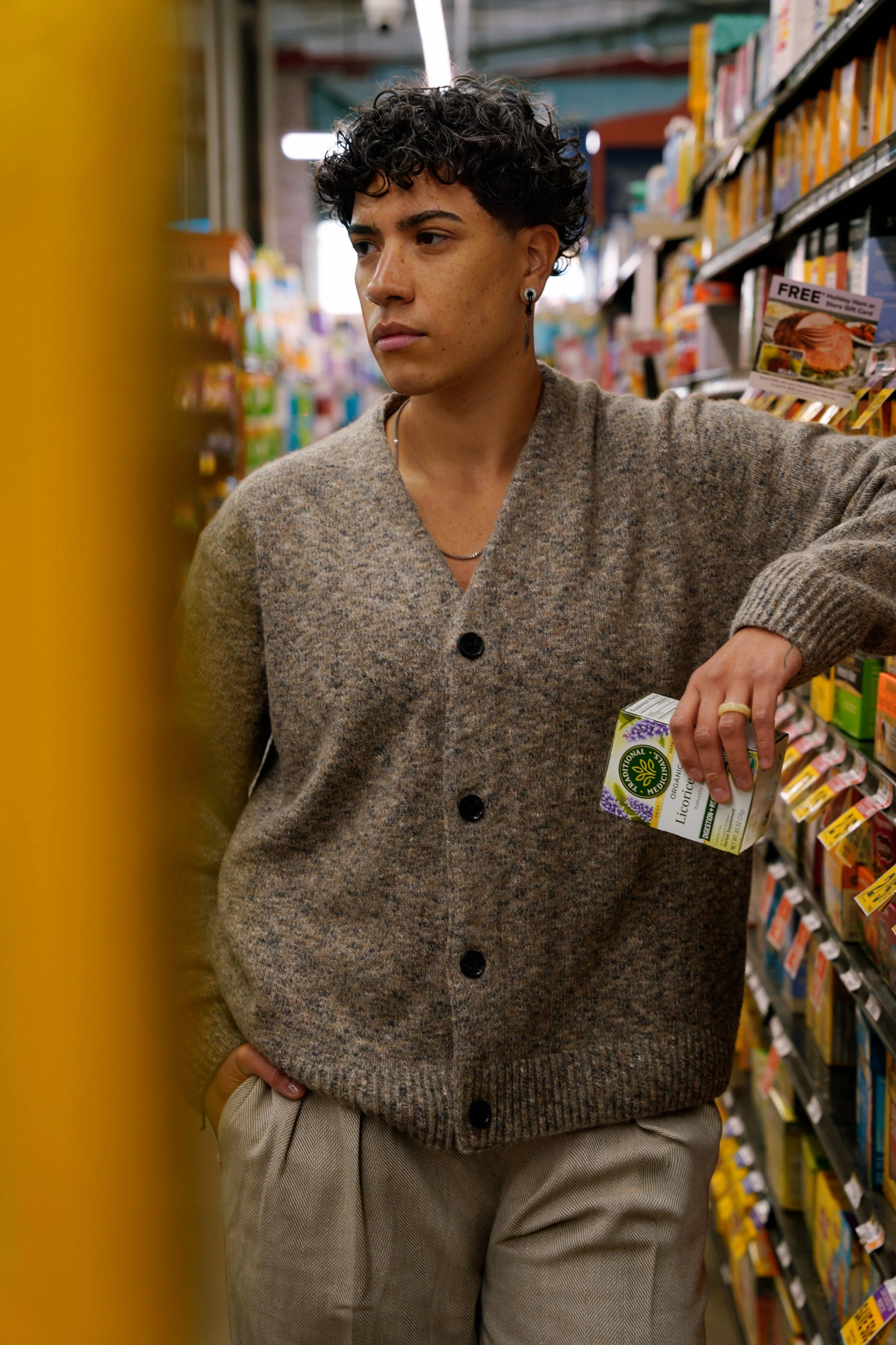
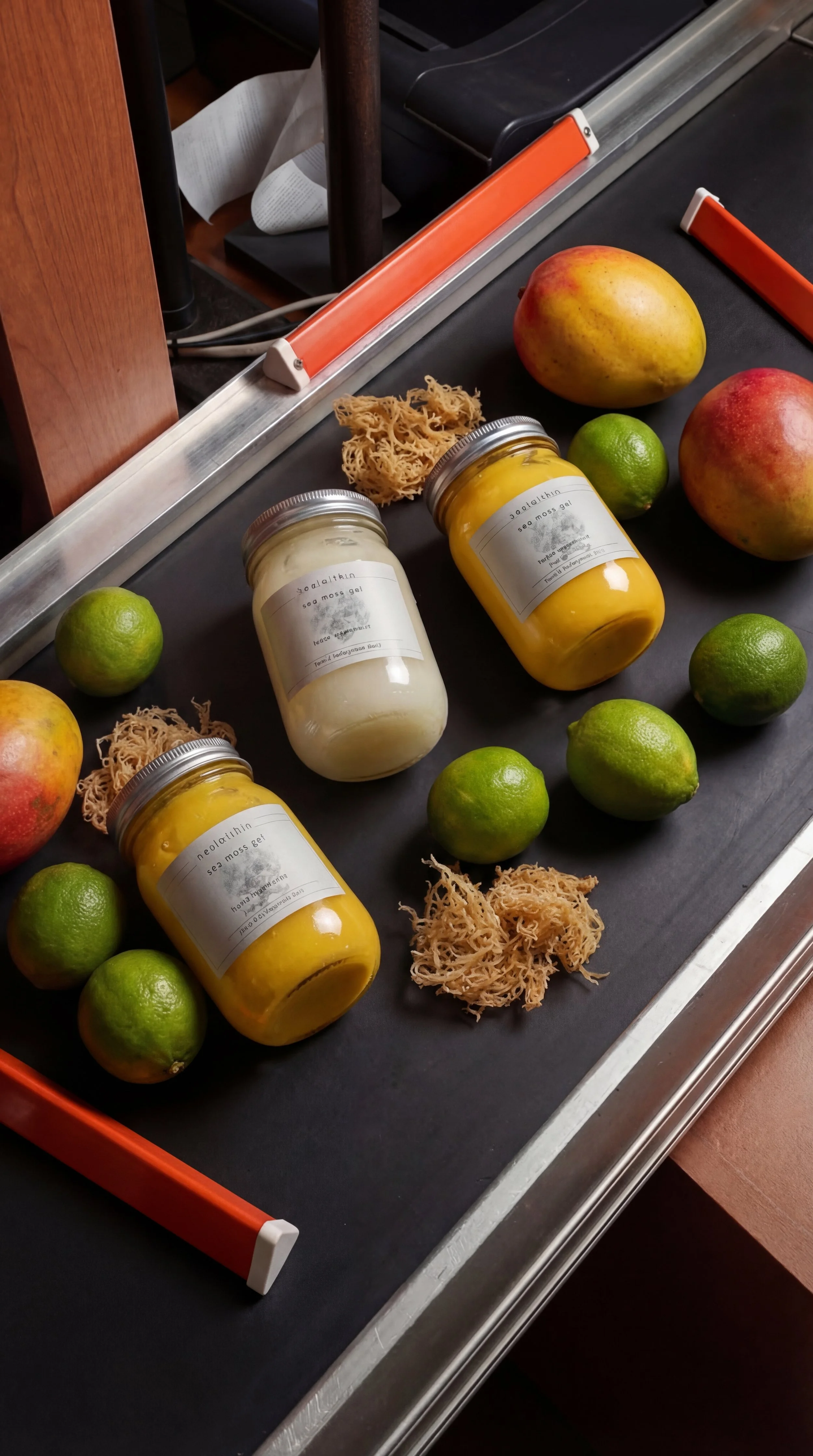
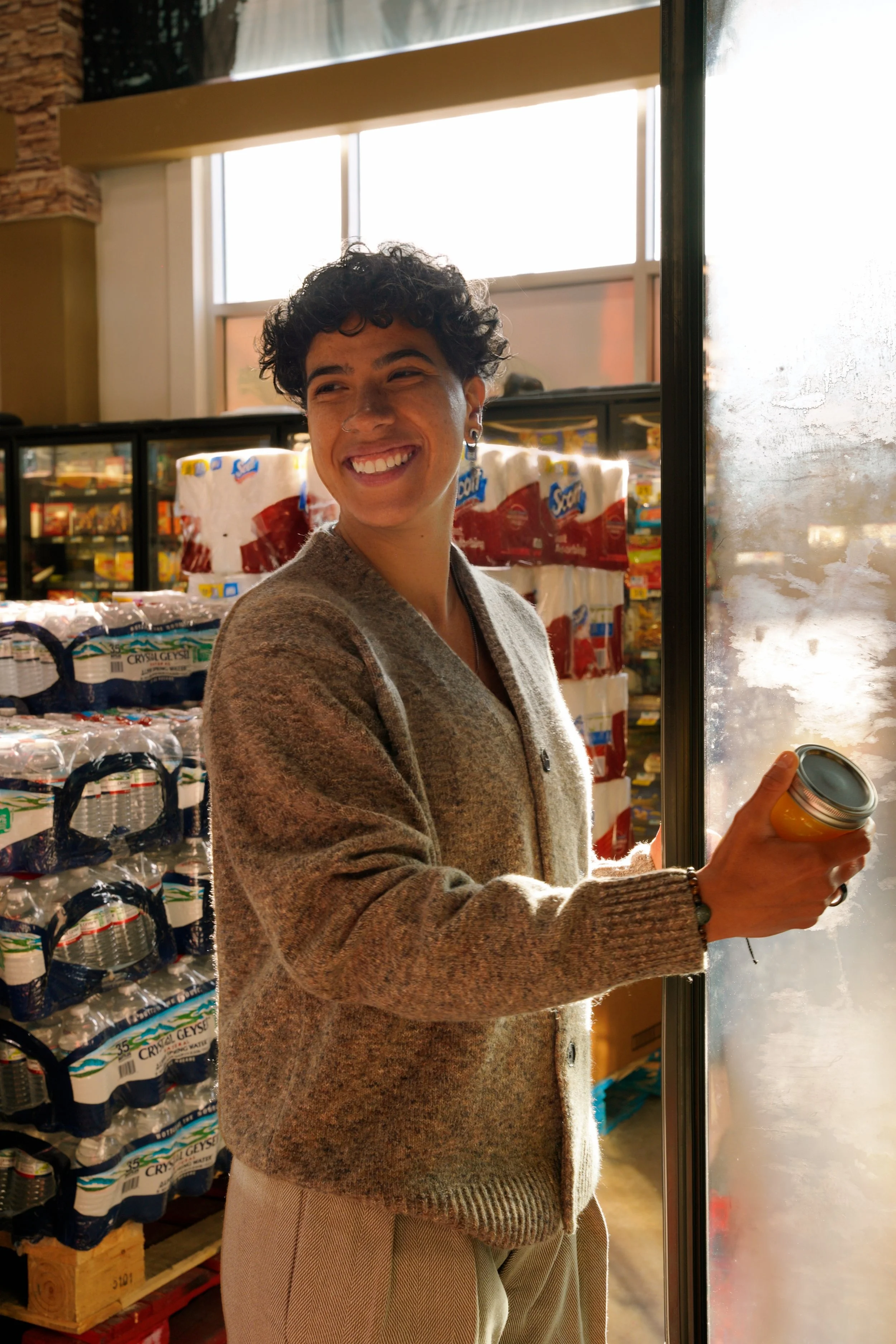
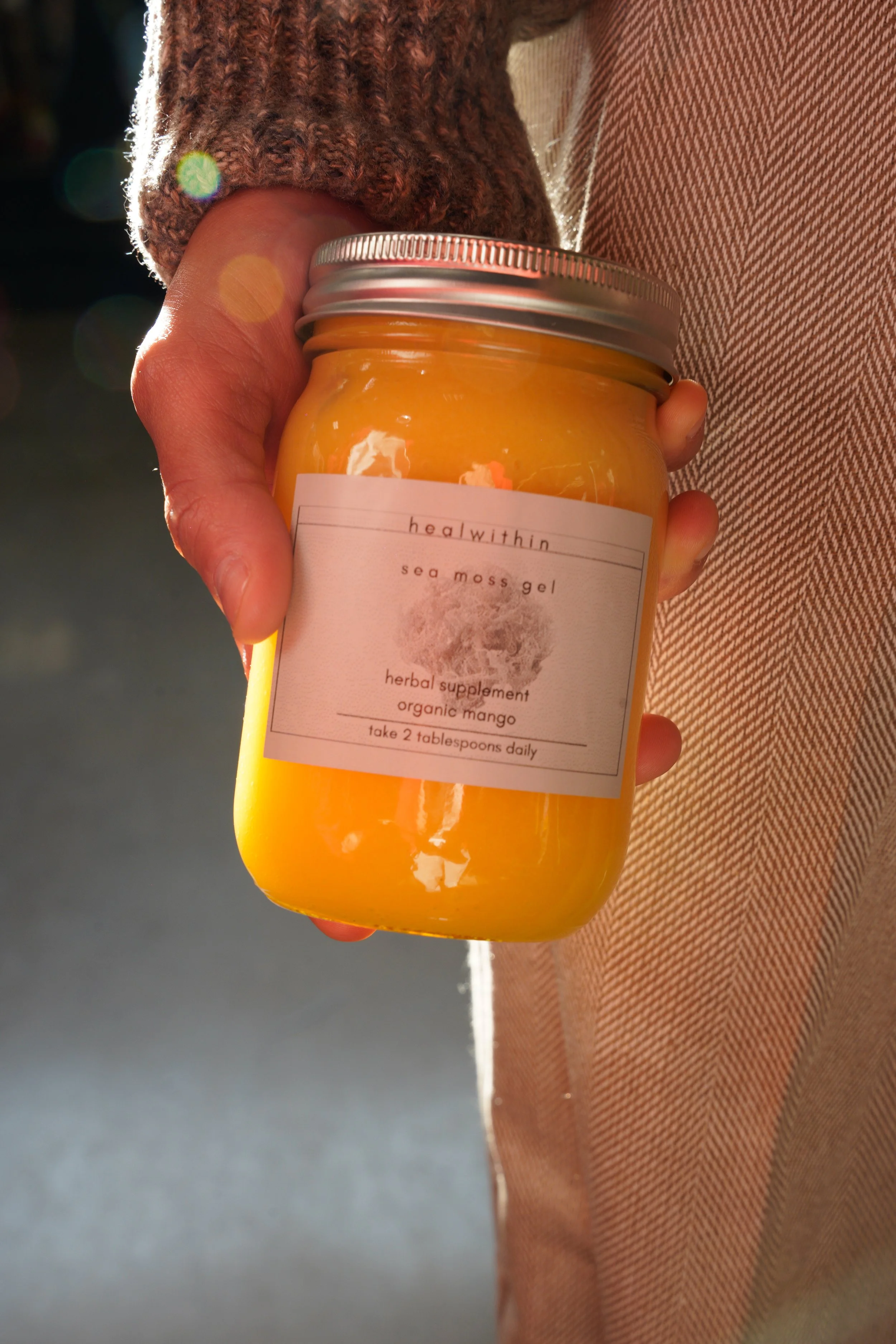
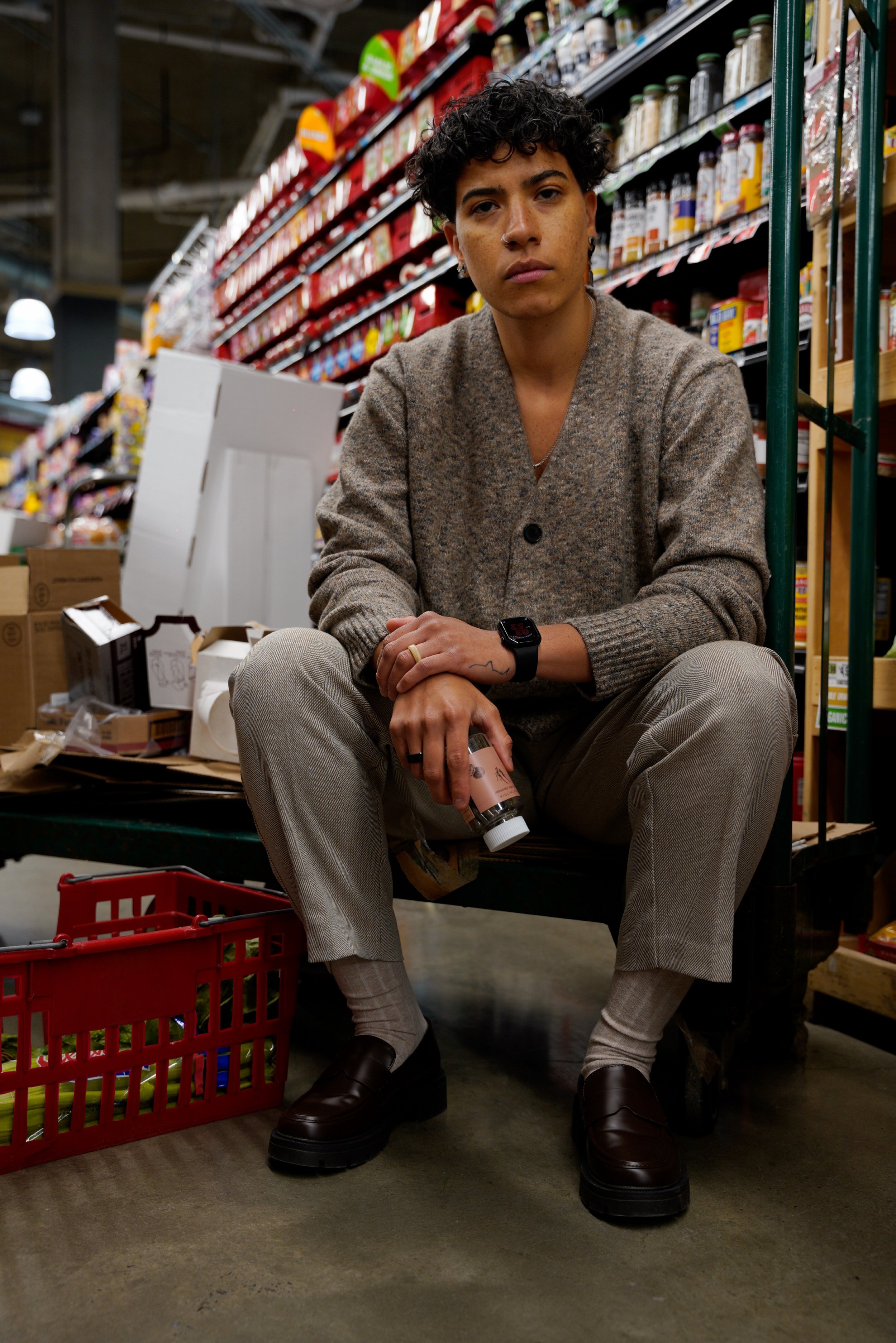
We developed a creative direction rooted in real-life environments..bringing the product into spaces that felt natural, intentional, and aligned with how the brand is actually experienced. From sourcing locations to styling each shot, we focused on creating a cohesive visual language that felt both elevated and approachable.
By blending in-studio product imagery with lifestyle moments captured in everyday settings, we built a content library designed to feel consistent, warm, and visually distinct across the feed.
PROJECT OVERVIEW
Heal Within was looking to refine how their brand showed up visually.
They had strong products and a clear mission, but needed their content to feel more cohesive, more elevated, and more aligned with the lifestyle they represent. The goal was to move away from a disconnected feed and into something that felt intentional, warm, and recognizable at a glance.
HOW WE HELPED
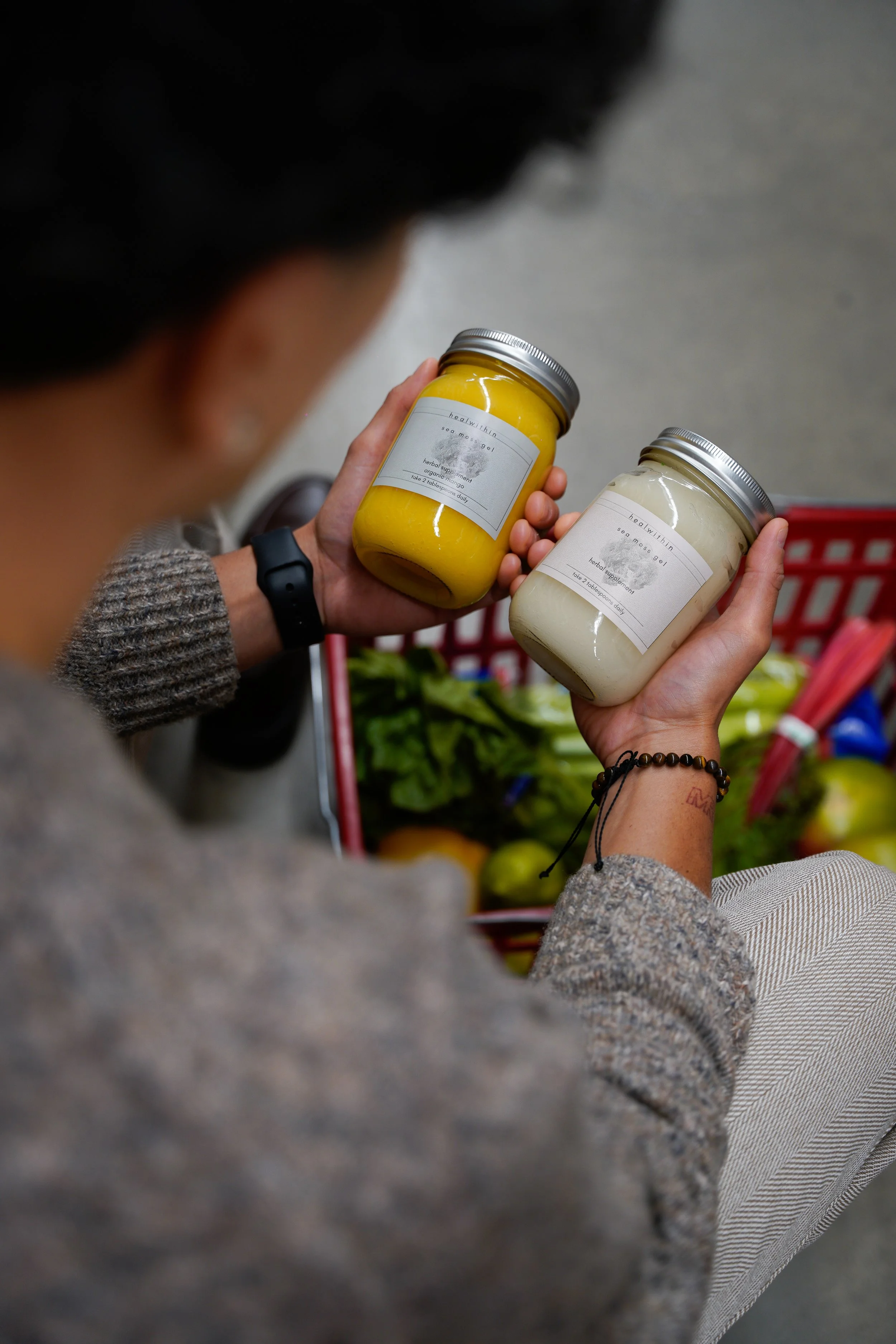
We helped bridge the gap between product and lifestyle.
By introducing intentional color direction, sourcing real environments like the grocery store, and pairing that with clean, styled studio shots, we created a balance between education and visual storytelling. Our focus was to make the content feel lived-in, consistent, and aligned…so the brand could show up with clarity while still feeling natural and approachable.
LET’S CONNECT